Roots
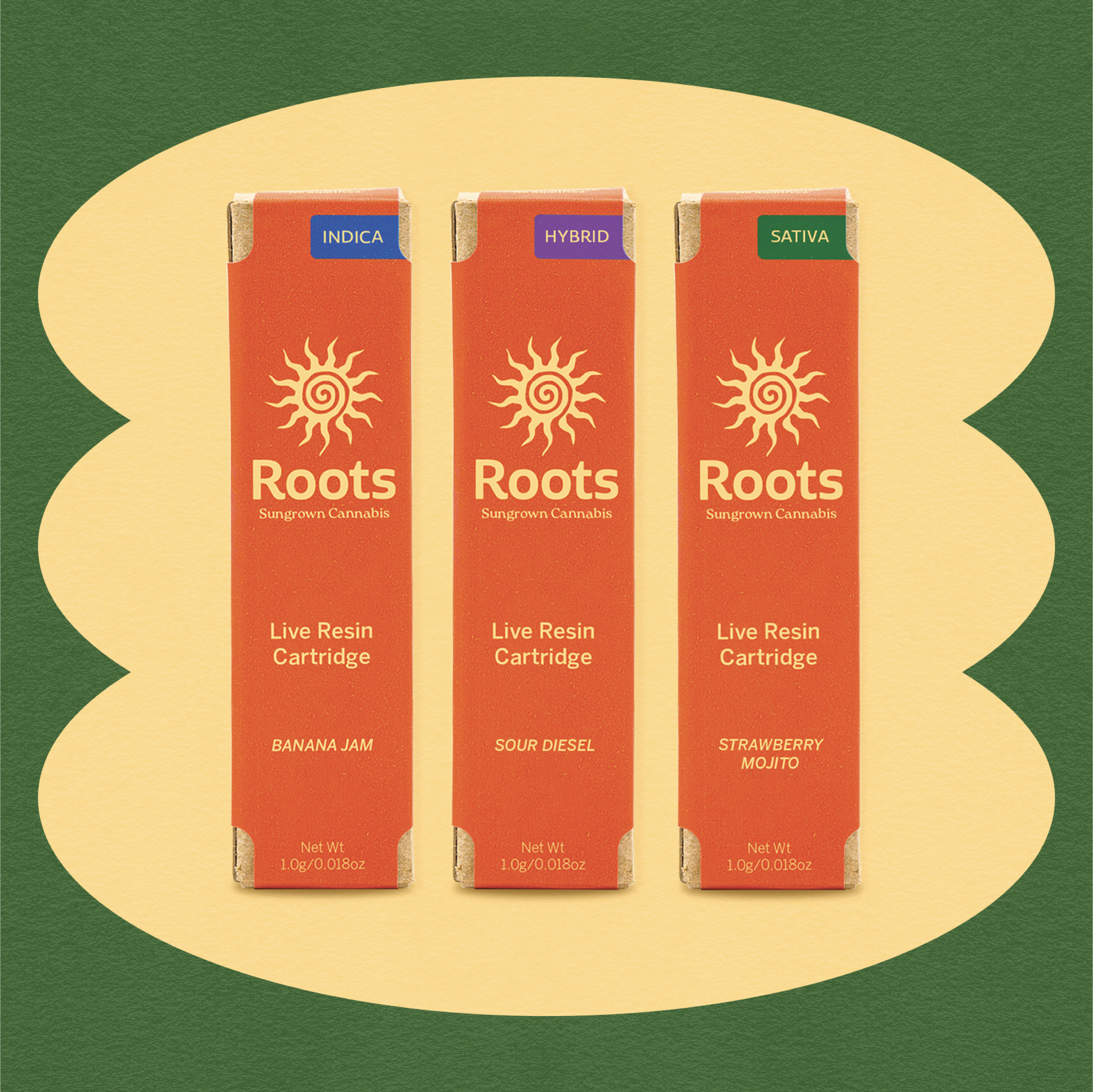
Roots embodies the perfect trifecta: potency, palatability, and price. With a strong belief that sun-grown cannabis is not only a better high, but also more sustainable for the earth, we aim to get your head in the clouds, without burning a hole in your pocket. All Roots cannabis is sustainably grown and housed in 100% recyclable packaging.
In collaboration with the director of marketing and the director of packaging, we redesigned the brand identity and packaging for Roots with affordability and sustainability at the forefront of the brand strategy.
Creative Direction
Visual Identity
Brand Strategy
Packaging Design
Print & Digital Design
Role
Annabel Worrall, Director of Marketing
Meredith Hudson, Director of Packaging
Wyatt Packer, Social Media Manager/Copywriter
Credits


BEFORE
The previous brand identity lacked visual interest and did not distinguish itself on the shelf. The logotype was hard to read (it didn’t help that the “R” was lowercase) and the brand utilized the color green, an obvious/common choice for a cannabis brand.

AFTER
I was given a set of values and attributes of the brand: friendly, warm, approachable, and straightforward which I incorporated into the brand identity with warm colors and a rounded logotype. The sun logo icon is a straightforward callout that this brand is sun-grown. The orange pops on a shelf, helping the brand stand out from competitors.